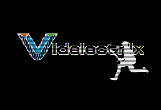
Intro with Videlectrix animation. It was hard to do this nicely as I was using page flipping (2x8k of RAM is 16k) and holding the data for the animation is big as well. It's compressed with LZSA which helps. It's slow though, in the end I had to leave half the frames out. The logo is decompressed to $9000, each animation frame is decompressed to the off-screen page, then the background is overlayed by bitwise OR-ing it before page flipping.
I originaly tried to do the OR-ing while decompressing to save time, but that didn't work. I forgot that LZSA uses the previously decoded data as a dictionary and so it didn't like it that I was superimposing a logo over its dictionary.
In the actual game there's music on this screen, but I didn't bother setting that up.
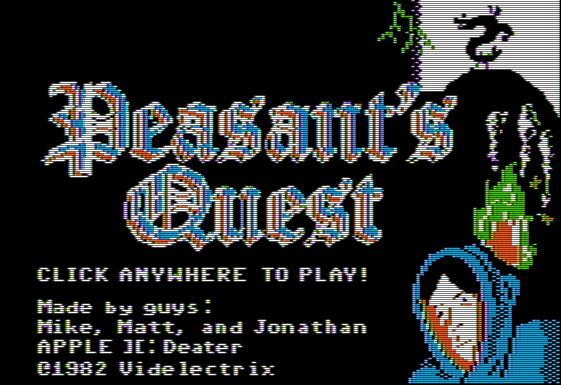
Title! This is actually a separate program being loaded from Disk. The programs are written to raw tracks of the disk, there's no filesystem at all. This saves 3k of DISK and 12k of RAM by not using DOS3.3. I use Qkumba's QBOOT boot-sector for disk accesses.
The music is based on a .midi file I found on-line and then hand coded up as a PT3 file using Vortex tracker. I use my own PT3 player that I wrote a while back (PT3 is a format used on ZX Spectrum and Atari ST for AY-3-8910 based sound, the chip can do 3 channels of square waves. The Apple II has no built-in sound chip, but Mockingboard expansion cards with AY chips existed at the time).
The Apple II does come with a beeper speaker, but there are no timers and you have to cycle-count for music. The Mockingboard sounds so much better, and also gives you the 3 channels the .midi file uses. The music routines are loaded at $E00 along with the second-stage boot loader and are left resident in memory.
Trogdor appearing when his music plays is just page flipping to an alternate background in PAGE2. This is done whenever the music decoder is playing music on channel C (only used for Trogdor music). This peeking at RAM belonging to the interrupt handler in another part of the system to see what's going on is something usually frowned upon in modern programming.
The fire animation should be at least three frames, but we didn't really have room for it. As is there's a 512 byte sprite that I roll through (rather than draw all at once) because it takes so long to draw I worried it would get in the way of flipping to Trogdor. Instead of having a separate buffer the sprite is swapped with the values on screen to save 512 bytes of RAM.
The fancy calligraphy text was a *huge* pain and I wasted a lot of time trying to get it legible.
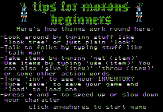
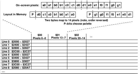
I had to write a HGR text drawing library as you can't write text to the graphics screen on Apple II (well you sort of can, but only by swapping out the bottom 4 lines of the screen to be text only). People have written amazing font libs for Apple II, here I am just using the stock font (which wasted nearly 1k of RAM, as you can't access the actual font ROM from software) and using a fixed-width 5x7 sprite routine. Why 7 wide? All Apple II graphics are in chunks of 7-pixels wide just to make things really complicated (remember, no divide or mod instructions on the 6502).
This 7-pixel wide thing guides a lot of decisions, it's a lot easier to have sprites in multiples of 7 and to move across the screen 7 pixels at a time. You just have to do a byte write to memory, or a load-byte/mask/OR/store if you want transparency. Otherwise you have to do a lot of slow and complex shifting and masking. It's why many Apple II games use 7x7 tilemaps.
Trying to get the knight sprites to look OK was also a challenge, due to the HGR rules things that look fine on a modern image editor often look horrible on an Apple II screen unless you know in great detail how the graphics work. You also can't just mirror a sprite and have it look like a mirror image, a lot of pixels will be shifted in odd ways.
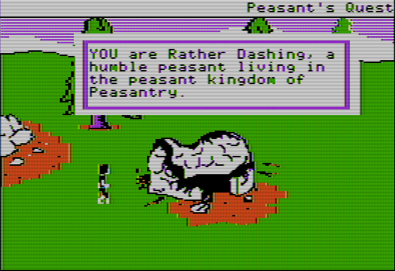
Thatched roof cottages! There wasn't room below $2000 to fit both music tracks, and my music code actually is optimized for speed/size so is only configured to play one song by default. However the bass track here is a subset of the longer title track, so the code self-modified the music to end early and loop to a different place. Self-modified PT3 files in RAM!
The "fast" rectangle background for the text is a re-use from my Hi-res Appple II Myst project. It's faster but still noticably slow. I even changed from using the ROM HPOSN routine to get the memory of each line (it's not linear, thanks Woz) to using lookup tables at a waste of 512 bytes of RAM and that helped a little.
You'll notice a flicker as things are drawn. In the end I'm not using page flipping here as it would complicate the code and this was supposed to be a quick hack. So I save the screen to PAGE1 after it's drawn and then reload the whole thing back to PAGE2 if I need to erase the signs.
You'll notice palette clash here a bit whenever green and orange touch it has to happen on a 7 pixel boundary so bumpy edges. For the burnt thatch I carefully chose what parts to make orange to make it look nicer.
Yes, the peasant sprites look awful. I tried to squeeze them into a 7x30 sprite as that made the code a lot easier. Part of the ugliness is because I am trying to use both color palettes, but if you do that and your sprite isn't exactly 7 pixels wide on a 7 pixel boundary you get issues, especially if you try to have transparency. That's why many old games have black backgrounds.
In addition with sprites odd vs even columns your colors will shift due to how apple II draws things. (blue might be 1010101 and orange 0101010 so if you just move things 7 pixels over, the colors swap). So to properly do things you need multiple copies of the sprite. I cheated and just let things look ugly and only move in increments of 7.
There are "proper" ways to get nice, fast sprites, but this inolves precompute sprites for every offset and such, and that takes a lot of RAM which I didn't necesarily have here.
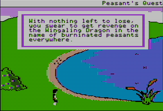
West lake is the best lake! Made special sprites here for the bubbling
The bubble sprites are just 7x5 sprites alternating based on frame count. The timing is just a busy loop checking for a keypress. The peasant's path is hardcoded in a list with a few events along the way based on a frame count to change the textbox or direction.
How did I do the backgrounds? I just did screen captures of the game running in a web-browser. The aspect ratio (probably intentionally?) maps the Apple II really well. So I cropped it to 1120x768, then scaled to 280x192 (with no dither), then touched things up by hand. You can use GIMP to convert to the Apple II palette but it has no concept of color clash so that's only so helpful.
You can try to fake additional colors with staggered horizontal lines as in the lake here. Blue/purple sorta looks like dark purple. On some CRTs orange/green almost looks yellow. Having stripes like this can be a pain if it touches a solid colored object though as it will give things a ragged edge.
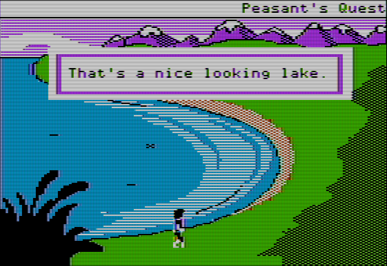
The game engine on the original game lets you be behind things like that plants. I didn't implement this as it's a bit of a pain and again was hoping for a quick hack. You just need to have a final step each frame that masks out background objects, the problem is I'm drawing everything onscreen so you'd see a flicker as this happened. My "Another World" demake does this properly (though it's lo-res and so the graphics are 8x smaller and much faster).
You'll notice the sky is lines of purple rather than solid blue. This is mostly to avoid issues where blue would cause palette-clash with the purple of the mountains and the green of the trees and grass.
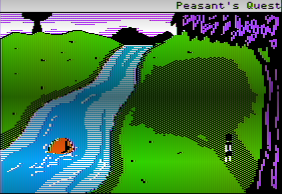
You can tell I was getting lazy here and didn't do a full stream animation. I do feel like the tree looks nice here even if it's a bit more pronounced than in the original.
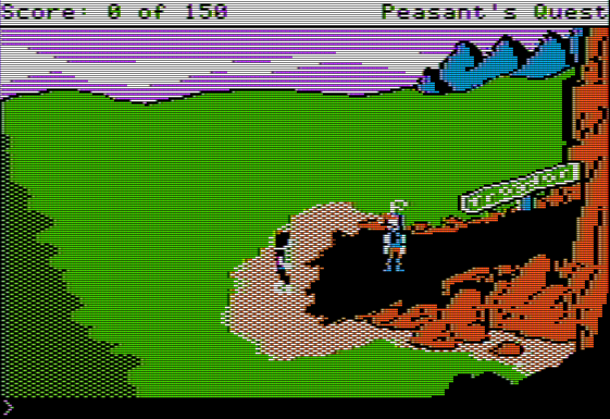
Getting these colors to work is such a challenge. Even though it's technically 280x192, really it's 140x192 unless it's black and white. So generally colors need to be two pixels wide when drawing things, but you also have to be aware of the every-7-pixels color clash. GIMP at least doesn't support having both 2 and 7 wide grids at once (as far as I can tell) which makes things difficult. (I guess maybe I could cheat and make image layers with grids to help here).
I made the ground black here so you could vaguely tell the knight was there among the rubble.
I'm proud that I managed to get the sign to almost legibly say "TROGDOR", that wasn't easy.
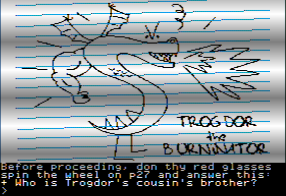
Fake copy protection time! I needed some reason why I hadn't implemented the entire game. And games from the 90s at least this was a common occurance. Though with 4am around no Apple II game can remain uncracked for long.
The original Trogdor drawing actually maps really well to the Apple II.
Getting the text input line was surprisngly straight forward, but don't try to backspace. And not for the reason that back-arrow/delete is always a problem on old Apple II machines.
The big (well one of the big) things keeping a full implementation of the game from happening is writing a text parser in 6502 assembly, but maybe that's not as bad of a problem as it sounds like it might be.
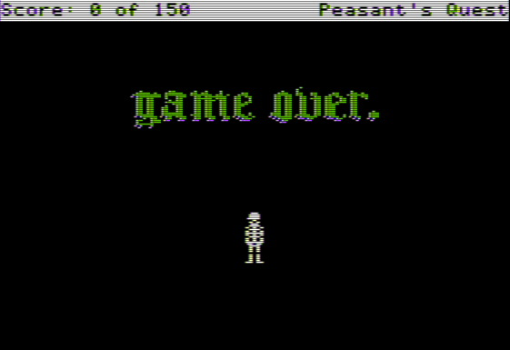
Game Over! Was too lazy to do the full death animation.
